GalleryPal
Art galleries and museums are looking for a way to improve their visitors’ in-person experiences. Museum visitors want to learn more about the art in order to get the most out of their visits.at a glance
Understand & Define
Sketch
Decide
Prototype
Test
the challenge
This project follows a Google Ventures sprint model, modified for a one-person team. All generative user research and business requirements were provided at the outset by BitesizeUX. My role in the project began at synthesizing the existing research.constraints
The solution must be a mobile appThe app must be designed as an in-person experience, so it must be used in the museum itself
scope
5 day timelineA high fidelity MVP prototype of a mobile appPreliminary usability testing
solution overview
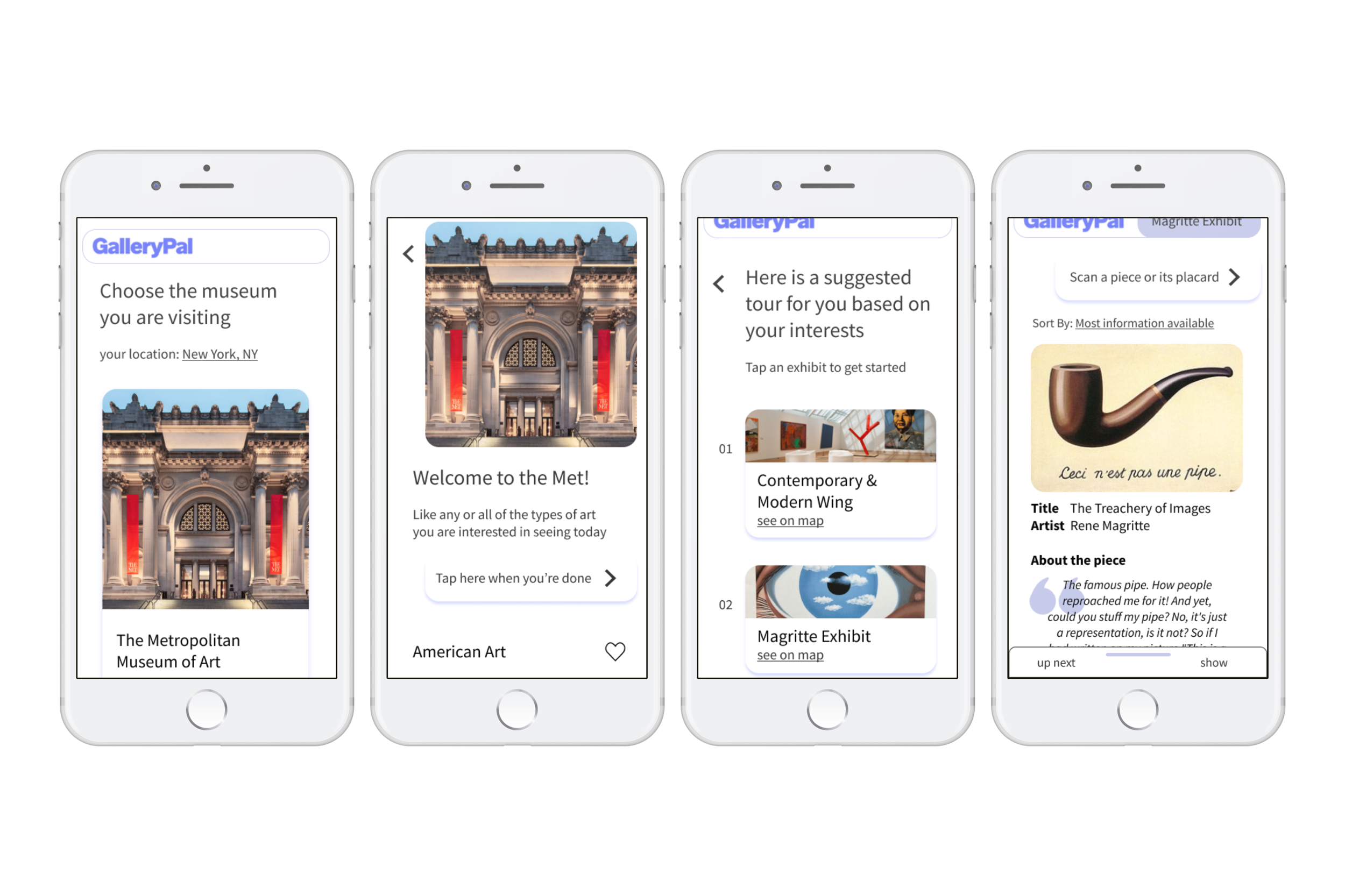
I created a mobile app called GalleryPal which serves as a companion app for museum visitors. Visitors can indicate the styles of art they are interested in for a semi-personalized tour, and each wing of the museum contains pages for individual pieces where they can read concise information about the art.
Day 1 — Understand & Define
What’s the problem?
1. Reviewed the research given by BitesizeUX
2. Understood the problem and why current methods were failing
3. Created a user journey map that addressed the problems identified in step 1
User research
Existing solutions and their problems
Reading placards
They do not have enough information or guidance
Attending a tour
Visitors cannot control the pace, or pick and choose which pieces interest them
Internet research
Sources are too dense, and visitors have a hard time skimming out the details that interest them
What information is important to visitors
The “inside scoop” on the piece
“I like forming my own opinion about art, but it can be hard to do that when I don’t really know anything about the artist, or what their intentions were in creating the work”
“There are so many times I find myself saying ‘how did the artist do that?!’ - I would love to know more about their process and technique”
Persona

Angela
23 years old | Art director
Needs
a quick resource to reference for more information about pieces that interest her
Wants
to make the most of her museum visit
Pain points
current references are too lengthy/dense for her interest level
“I don’t need to know everything, I just don’t want to feel like I was missing out on something.” - Angela
a solution would need to include
Optional guidance over path/pace
An indication of which pieces have the most information
A way to break out of the path with the option to return
Information that can be skimmed
From these four insights, I created a rough idea of a GalleryPal user journey.
Day 2 — Sketch
Improving current methods
1. Looked for inspiration from art education and queue apps
2. Quickly sketched solutions using Crazy 8s technique
3. Settled on a design and sketched out a couple frames
1. Inspiration strikes!
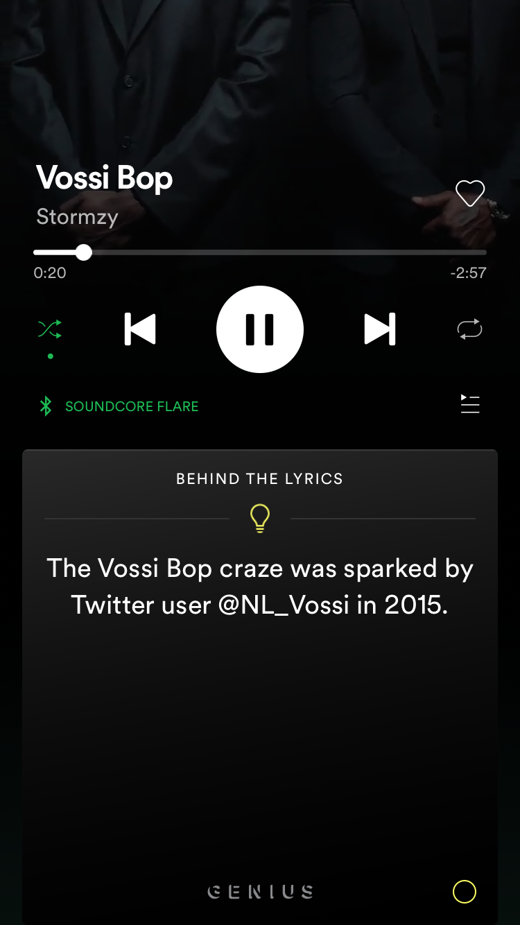
I primarily looked at art education apps (of course) and music streaming apps, because I was inspired by their queuing structure and how it could be applied in the context of an art tour (Spotify : song :: GalleryPal : art piece).
| What works? | What can GalleryPal improve? |
|---|---|
| Scanning pieces | Provide an alternative to scanning |
| Informational pages for individual pieces | Make individual pages less dense/easier to skim and highlight information users find most interesting |
| Iconography | Iconography needs to break up a lot more information |
| Queue structure | Queue needs to be more easily accessible, rather than hidden behind a menu |
2. Inspiration fails
Okay, not actually. I used the Crazy 8s sketching technique (eight app sketches in 8 minutes), to quickly generate ideas for possible solutions.Crazy 8s, aka the “How many kinds of apps can there really be?”
3. The solution
I chose a cross between sketch 2 and sketch 6 from Crazy 8s. To best address the problems identified by the research, the solution sketch included an (optional) personalized tour route of the museum, scannable pages dedicated to individual pieces, and a queue of pieces in an exhibit or wing as a suggestion of direction.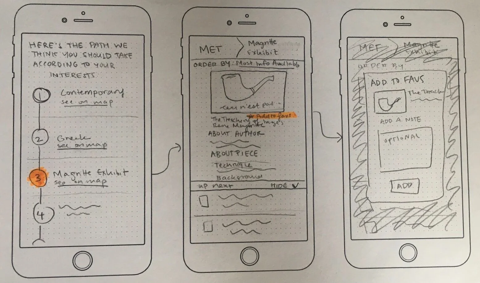
Ultimately, I removed the “add to favorites” functionality because the existing research did not suggest a need for it in an MVP — but more on that later!
Day 3 — Decide
What does a solution look like?
Created a storyboard to tell our persona Angela’s user story
How is GalleryPal going to work in the context of a user’s life?
Angela Goes to the Museum: The Storyboard
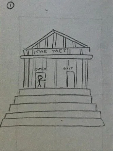
1. Angela is headed off to The Met (a very creative choice by this NJ native)
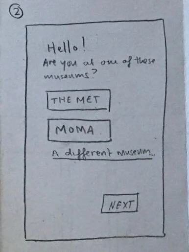
2. Angela is prompted to select the museum she is visiting
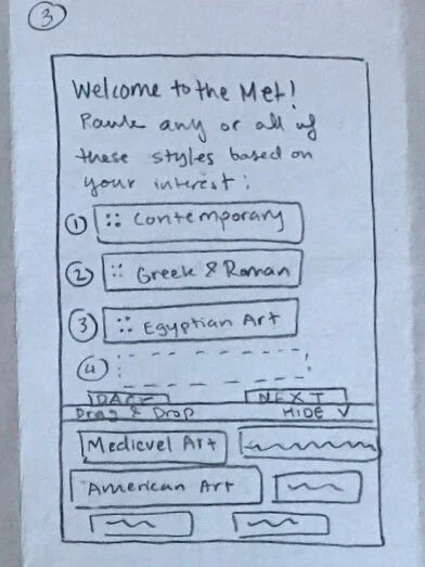
3. Angela can optionally rank what kinds of art she is interested in seeing
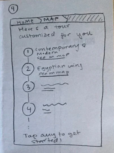
4. GalleryPal creates a tour of the museum based on Angela’s interests
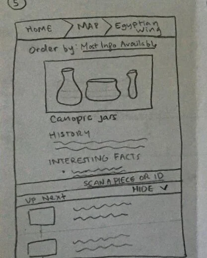
5. Once Angela tap into one of the wings, she is presented with a list of the wing’s pieces, ordered by how much information is available about them
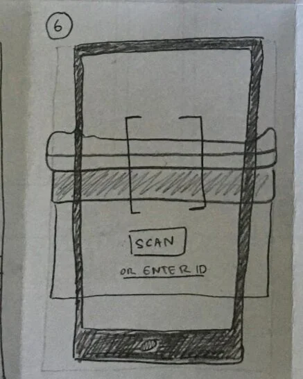
6. If Angela wants to learn about a piece that is not up next in her queue, she can scan the item or enter the ID on its placard and it will insert itself next in her queue.
7. The scanned piece is added to the queue, and following pieces maintain their previous order
Day 4 — Prototype
Let’s make it!
Created high-fidelity prototypes of the GalleryPal MVP in preparation for user testing on Day 5
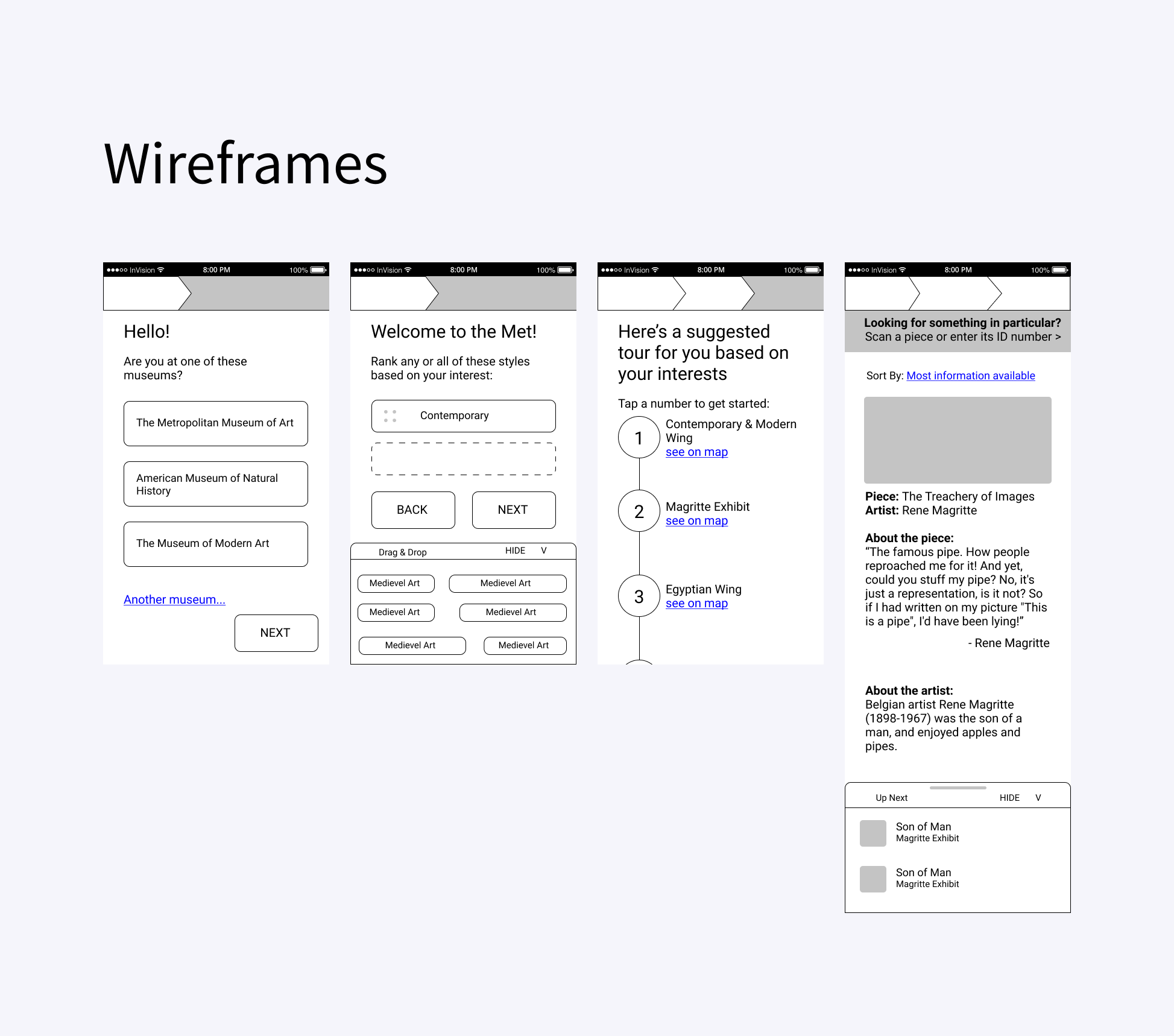
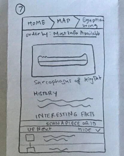
Wireframes
Anyone who can jump right into high-fidelity prototyping is surely a witch. I created some quick wireframes to finalize the GalleryPal’s structure and make sure that the sketches could be translated into a usable and intuitive app.
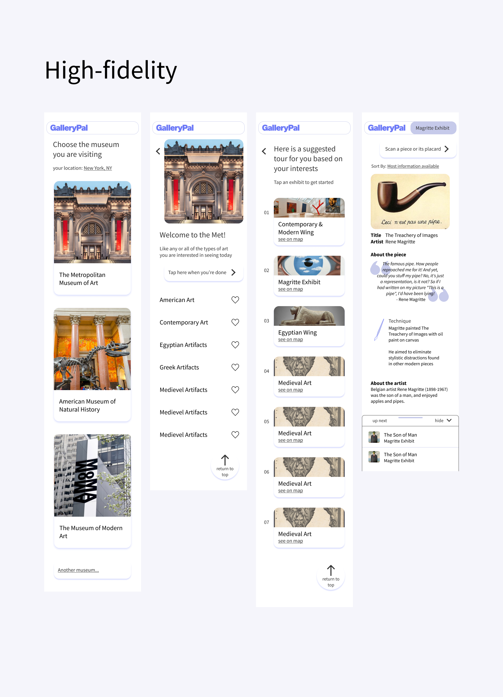
High-fidelity
simplicity
Because GalleryPal is a supplementary museum companion app and not necessary for their core museum experience, the amount of time users will spend trying to understand how it works is likely very limited. I wanted to make the buttons and text large and sparse so users’ eyes are directed at what they need most.
scannability
Each page for individual pieces will have several facts for the user to read, and it cannot come off as a big block of text. One recurring concern in the user research was that existing online sources are too dense and impossible to read. To improve the users’ ability to skim, I included icons in purple to serve as indicators for what kind of information can be found in each section — for example, the examples I used in my mockups were quotation marks for a quote from the author, and a paintbrush to indicate a section about technique.
The prototype
Day 5 — Test
User testing
Conducted interviews and usability tested the MVP
Testing
methods & participants
GV’s “5 Act Interview”
5 remote participants
overview
In general, GalleryPal was well received. Participants indicated that they were unsatisfied with the resources available to learn about art at museums, further validating the idea for GalleryPal. The semi-personalized tour was a delight factor, and participants liked that they could see where each wing was on a map within the app itself.
issues to address in another iteration
The queue was confusing to some people - the order in which the pieces are presented needs to be tested further, as the “most information available” order seemed at odds with participants’ mental models of how museum tours work.
Some participants wished there were other kinds of information available, like dates or timelines
The option to see more information or links to the more dense sources if the user so desires
Conclusion
Takeaways
Insights vs Assumptions
When given autonomous control over a project like GalleryPal, getting carried away and making “intuitive” leaps from existing research can lead to extraneous features users actually don’t need. I learned to really look at the decisions I was making and differentiate between insights and assumptions. Nothing in the user research implied that users wanted to refer back to the facts they learned at the museum, and yet I originally included “add to favorites” functionality so they could do just that. Similarly, I originally included ranking functionality in my wireframes when users indicated the genres they were interested in, but this was a step beyond what interview participants had indicated and more than minimally viable functionality.
Democratize UX (a little)!
Even though this was a solo sprint, I saw how a design sprint could be a great tool to bring in other stakeholders to get their opinion, bring them into the process, and maybe even increase their understanding and appreciation of UX. While this was a fantastic experience solo, I am really looking forward to running sprints in the future with a team.
Next steps
Because this was a sprint, the participants were a convenience sample. The led to some variability in participants’ habits and interests when it came to museums. In the future, I would like to set participant qualifications and send out a screener survey to more accurately target users who would find an app like this to be beneficial.
I would want to explore the bigger picture of the museum experience — if users want information before they visit, or to refer back to the information they learned after their visit, etc. Next steps I take would include user interviews about these topics.
Contextual inquiry - how does it work in a museum setting itself