Activate
Activate is a mobile app that aims to help sedentary workers adopt a more active lifestyle.
at a glance
Intro
Secondary research & analysis
Primary research & analysis
Solution ideation
Sketching & wireframing
High-fidelity
Usability testing
Conclusion
overview of the solution
The problem I wanted to address was the difficulty full-time, sedentary workers have when adopting an exercise routine. Activate encourages users to start at the most basic level by simply making more active lifestyle choices per week. A weekly reward serves as external motivation, and by building internal motivation via visual depictions of their progress, users will be motivated to continue building a strong habit that can convert into an exercise routine beyond active lifestyle decisions.my role
Activate was a solo project, so everything the light touches was completed by myself.
tools & methods
Figma
Marvel
Miro
Personas
User Interviews
User Flows
Empathy Mapping
Affinity Mapping
HMW Statements
Secondary research
Why hasn’t this problem been solved yet?
There are hundreds of exercise companion apps, programs, and materials that aim to help their users work out. However, this problem clearly still exists indicating that something is missing. To get a better sense of this missing component, I read some existing research on the topic. How to build a habit
I wanted to understand how people build exercise habits, and what strategies work best to reach the goal of a routine. Of course, that was a slippery slope into “how and why do people engage in any behavior” — where I learned about the Theory of Planned Behavior (TPB).
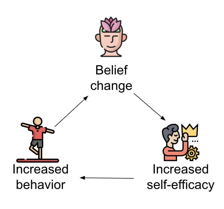
One of the studies on the TPB, The Impact of Working Life on Health Behavior, finds a possible cyclical relationship:
“… increased exercise behavior leads to belief change and thus increases self-efficacy”
In other words, exercising more often can help a person feel more confident in her ability to continue exercising, which in turn motivates her to continue exercising without giving up.
Of course, the problem with the cyclical model above is that it happens in a vacuum. When stresses from work and life are introduced into the mix, sometimes it’s not enough to get a person through the first few cycles it takes to build a habit.
Existing apps assume that the motivation to continue through the cycle is there, but something isn’t strong enough to push it through.
Primary Research
What are the people saying?
Interviews
what
5 (remote) semi-structured user interviewshow
Screener surveys were distributed to Slack channels and friends. The 5 participants were chosen based on their qualificationsparticipant qualifications
Must work 40+ hours a week (to account for added work stressors)Must have exercised at least once in the past 2 months (needed to have at least a baseline interest in exercising)
Analysis
theme identification
Affinity map from primary research user interviews (click to zoom)
Loss of motivation (internal, external, and quarantine-related)
Motivation (internal, external, and mental health-related)
Social aspect
Workout characteristics (what constitutes as exercise?)
Progress markers
Ease
Regularity / integration with daily life
understanding the user
Empathy map from primary research interviews (click to zoom)
Unsustainable goals | Participants were setting exercise goals for themselves that were too ambitious and unsustainable.
Once needing to exercise became an additional stress in the day, it was removed | Whenever participants were able to exercise in a day, they viewed it as a positive addition. Conversely, lack of exercise was not a negative unless they had originally planned to.
Preference for unsustainable workout options | In an effort to keep exercise interesting and a non-stressful addition, participants sought out fun or interesting forms of exercise like a workout class. These also tend to be the most inaccessible, because they require time, travel, and can be expensive.
Persona
Liz the Exercise Novice Persona (click to zoom)
about Liz
Liz wants to
feel productive
see measurable results
accommodate her changing work hours
maintain or improve her level of fitness
maintain or improve her internal motivation to exercise
How might we help busy, unmotivated individuals set more attainable exercise goals?
How might we accommodate for a full-time worker’s busy or changing work schedule?
How might we encourage exercise beginners to lead a more active lifestyle without adding stressors that are too overwhelming?
Solution ideation
What should we do about it?
With HMW statements as scaffolds, I took the first step in filling in the structure with rapid text brainstorming. I created a list of 20 somewhat reasonable ideas, from which I whittled down the three most likely to yield a result to serve as a solution for the HMW statements.
“The Active Lifestyle Encourager”
was the solution I landed on. The other two options I had very creatively titled The “No Pressure but You Could” and The Aggressive One, so it seems the Active Lifestyle Encourager was always meant to be.
User stories, created using the Liz persona and findings from primary research, helped narrow down what functionality was necessary for an MVP release. Main functions were:
1. Account
2. Add/Edit Entries
3. Tracking Progress
4. Voucher Logistics
5. Reminders
User flows, created using user stories, give a high-level sense of what steps the user will take to accomplish the key functions identified above. The flows outlined here include:
Log In/Sign Up
Onboarding
Modify Entry
Redeem a Voucher
Sketching & wireframing
What will a solution look like?
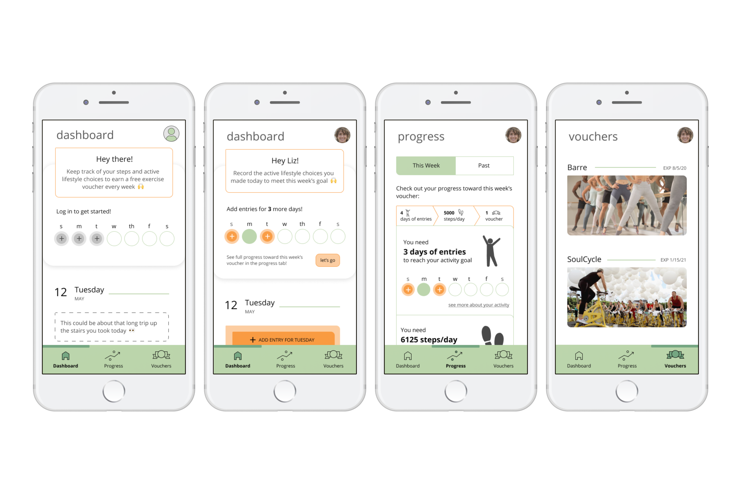
Considering the paths defined by the user flows, certain functions became clear. There would need to be “edit” functionality, progress tracking functionality, and voucher tracking functionality. These naturally split themselves into three tabs, one for log entries, one for progress, and one for vouchers.
Check out my sketched prototype on Marvel!
Before converting sketches into wireframes, I conducted guerrilla usability testing to ascertain that the functions had been translated from the user flows intuitively.
main takeaway from dashboard tab
New entry, edit entry, and delete entry are the core functions of this app. Users should not have to think at all about how to accomplish each of these tasks.
main takeaway from progress & vouchers tabs
The progress tab needs more structure to allow users to more easily comprehend their progress.
High-fidelity
What will the solution really look like?
The first step to high-fidelity was to create a mood board for style, colors, and of course, mood. The words I used as inspiration were “simple”, “low-stress”, “productive”, and “open”.
The greens were chosen to convey calm and success.
I wanted one of the core colors to be warm, but red is too urgent and alarming and one of my key findings was that users like Liz tend to drop their exercise practice when the pressure is too high. I opted for an orange to convey energy and optimism.
round 1 of designs
“Tidy desk tidy mind” mentality
The design only includes necessary components so interactions with the app can happen in the quickest, most convenient way possible.
Colors
Orange as the action color | The dashboard has the most orange, as its the page that requires the bulk of the user input. The color is meant to energize the user and call their attention more easily to the CTAs.
Green as the “success” color | The progress tab is largely green to instill a sense of accomplishment. The function of the page is nothing but the enjoyment of their progress.
Usability testing
These initial key screens, though more visually engaging than the sketches and wireframes, were also more complex, and to make sure the app was still effective in its goals, I moved on to usability testing.
takeaways for dashboard tab
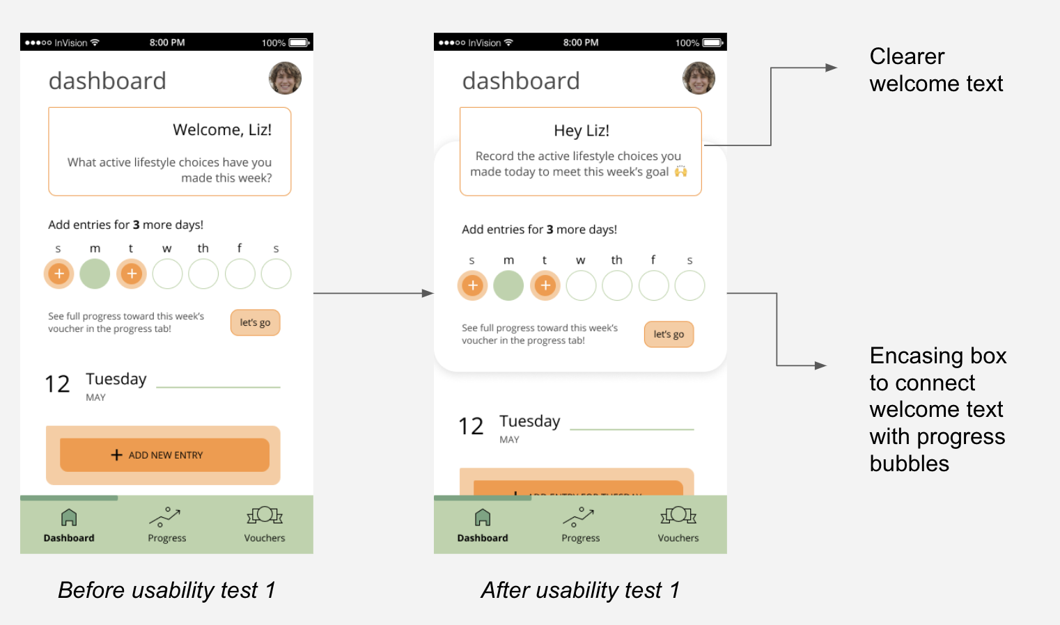
The purpose of the dashboard was not immediately clear to several usability participants. It was not scannable, the welcome text didn’t do a good job of summarizing, and the progress bubbles were too separate from the welcome message, so participants weren’t sure what their purpose was. Participants usually read off everything on the page before they summarized what they thought the page was for.
solution | I made the welcome text more straightforward while keeping the friendly, encouraging tone, and encased the welcome message and progress bubbles in the same box so users could identify it as one entity
takeaways for progress tab
The features on the progress tab were too disparate that they did not fit into the same mental model that the participants had about what they would find on that page. This is a similar issue found during guerrilla usability testing of the initial sketches. I had added headers to impose more structure, but this round of usability testing revealed that the main source of confusion was that users experienced two kinds of progress in this app - progress towards the present week’s goal, and past progress that showed their habits and growth.
solution | I created a “this week” and “past” tab
Conclusion & takeaways
Takeaways
I need to evaluate assumptions at every stage of the process — this became apparent with the Progress tab. From the guerilla usability testing of initial sketches to round 2 of usability testing with the high-fidelity screen, participants always found something to be hard to understand or didn’t feel like the screen was properly serving their purpose.
I would also conduct competitive analysis later on in the process after solution ideation. This would allow me to explore competitors that align with core aspects of my solutions, rather than just aligning with industry. For example, I mainly looked at other exercise apps when I did my analysis for Activate. When I decided to address the underlying habit building aspect, I would have benefitted from looking at companies like Noom which have a similar focus on psychology.
Next steps
I conducted a second round of usability testing after the redesign. Many of the usability issues had been cleared up, but there is still goal-oriented progress to be made. If I were to continue this project, I would conduct research on the kinds of data visualizations that are best suited to conveying a sense of improvement. Participants mentioned wishing the progress diagrams were more engaging.