Kleva Health
Kleva is gearing up for their launch to provide at-home COVID testing. In preparation, I helped conduct user interviews, usability testing, and created wireframes and high-fidelity prototypes in mobile and desktop views, focusing mainly on the E-Commerce interfaces.at a glance
Intro
Research questions & findings
Updating wireframes
High-fidelity
Conclusion
Client testimonial

the challenge
Kleva Health’s mission is to provide at-home COVID tests during this uncertain time. Back in August, when the US was coming down from its first wave, they were preparing for a launch to do their part in increasing access to tests for upcoming waves. Kleva brought me on board to build and refine their E-Commerce UI/UX.
scope & timeline
40 hours (over 4 weeks)Generative user interviews & usability testingFinalize wireframes, implement section of high-fidelity screens
team
Vivek - UX Design Lead
Saumya - UX Designer, Customer Dashboard
Patrick - Dev Lead
Kai - COO
my role
During my time with Kleva, I was the primary designer for the website’s E-Commerce UI/UX. I worked with stakeholders (under ‘team’) to understand Kleva’s needs and created a wireframe prototype to test with users. I then helped conduct the first round of user interviews and usability testing, and iterated the existing prototype to reflect learnings from participants. Finally, in accordance with Kleva’s brand & style guides as well as user research, I developed the first high-fidelity iteration of their ‘wellness check-in’ flow.First thing’s first — the following are research questions to guide round 1 of user interviews and address assumptions in pre-interview prototypes:
What situations prompt people to seek out a COVID test?
What is important when choosing how/where to get tested?
How do people decide which sources to trust?
What are the main COVID-related concerns?
Research
method
5 remote semi-structured user interviews,
30 minutes general, 30 minutes usability testing
my role
Led two interviews, assisted two interviews
Synthesized and applied findings
Constantly changing COVID information causes uneasiness
People who are not personally invested or medical professionals do not have the right tools at their disposal to keep up-to-date. Access to a medical professional was cited as feeling like the only way to truly get informed.The need for a test is often triggered by a time-sensitive event
Turnaround time is very important to people getting COVID tested. Some people need a negative result in order to participate in an event, and some just need peace of mind before they visit their elderly/at-risk parents. Often, they would choose their test based on how quickly they could get results.External sources, team transparency, and up-to-date information contribute to overall trust in the product
As an emerging company, Kleva does not yet have pre-established trust with its user base. From interview findings, links to trusted sources, showing credentials of the team, and anticipating user questions and answering with quality information were all identified as important ways to build trust.Price for test is steep, no indication of insurance options
Participants were willing to pay more for an at-home testing option, but not as much as the test costs before insurance. They were not given enough information to feel like they had any option but to pay the full amount.
Uncertainty is the name of the COVID-19 game, and we found that we were not establishing nearly enough trust to help our users feel secure.
“I’m looking for safety, not a product”
| Points to address | Priority |
|---|---|
| Website experience leaves users feeling rushed to buy a test before they have established trust in the product | Highest |
| The process differs too much from users' mental models/expectations | Highest |
| User questions about COVID aren't being anticipated and answered | Medium |
| Transparency about process/privacy | Medium |
| Timeline/turnaround time is unclear | Lowest |
| Highlight insurance options | Lowest |
These points were all chosen because they came up the most consistently and were the most important sticking points with the interview participants. They are ordered by how much needed to be changed from the current prototype.
Wireframes
Updating the prototype from research findings
Home screen overhaul
Lack of trust was the most urgent finding from user interviews. Going through our participants’ responses, I distilled the high-level lack of trust into 3 more concrete types of distrust →
Lack of trust in the information presented
COVID-related information changes so often and quickly, how do I know I’m getting the most accurate information?Lack of trust in Kleva
A new company without a pre-established track record is going to initially have to rely on external corroboration to build trust with its user base.Lack of trust that Kleva has their best interests at heart
This one’s a subsidiary of “lack of trust in Kleva”, but it refers specifically to users looking for comfort and assurance in the pandemic, but being wary of the numerous companies that have popped up just to make a profit.
I realized the home page fell short with regards to all of these types of distrust, and being the first page users see, it needed to address these doubts from the start.
solution
I revamped the homepage to focus on the information and removed all explicit mentions of the selling of the product. “Order the Test” was changed to “Learn more about the test”, since the original prototype also simply linked to the informational product page. Because Kleva is a new company, I added sections dedicated to verification from other, already trusted sources. I also included a link to learn more about Kleva’s team, so users can be reassured that medical professionals are actively involved in the process. Similar copy changes and transparency protocols were integrated throughout the rest of the wireframes.
Unexpected steps & unfamiliar language
background
During testing, there were a few aspects of the website that didn’t match participants’ expectations - the “wellness check-in”, or “eligibility test” at the time, was the most major one.
The provider network Kleva has partnered with requires some information about users, the same way a doctor might ask a patient some questions when they go in for testing in person. This is partially to make sure those in greatest need get a test in case of a shortage, and so this process was originally called an “eligibility test”.
mismatch between system and real world
Calling the flow “eligibility” left users wondering if A - it had to do with insurance eligibility or worse, B - “I can’t imagine a doctor in real life turning me away from a test”.
too many steps!
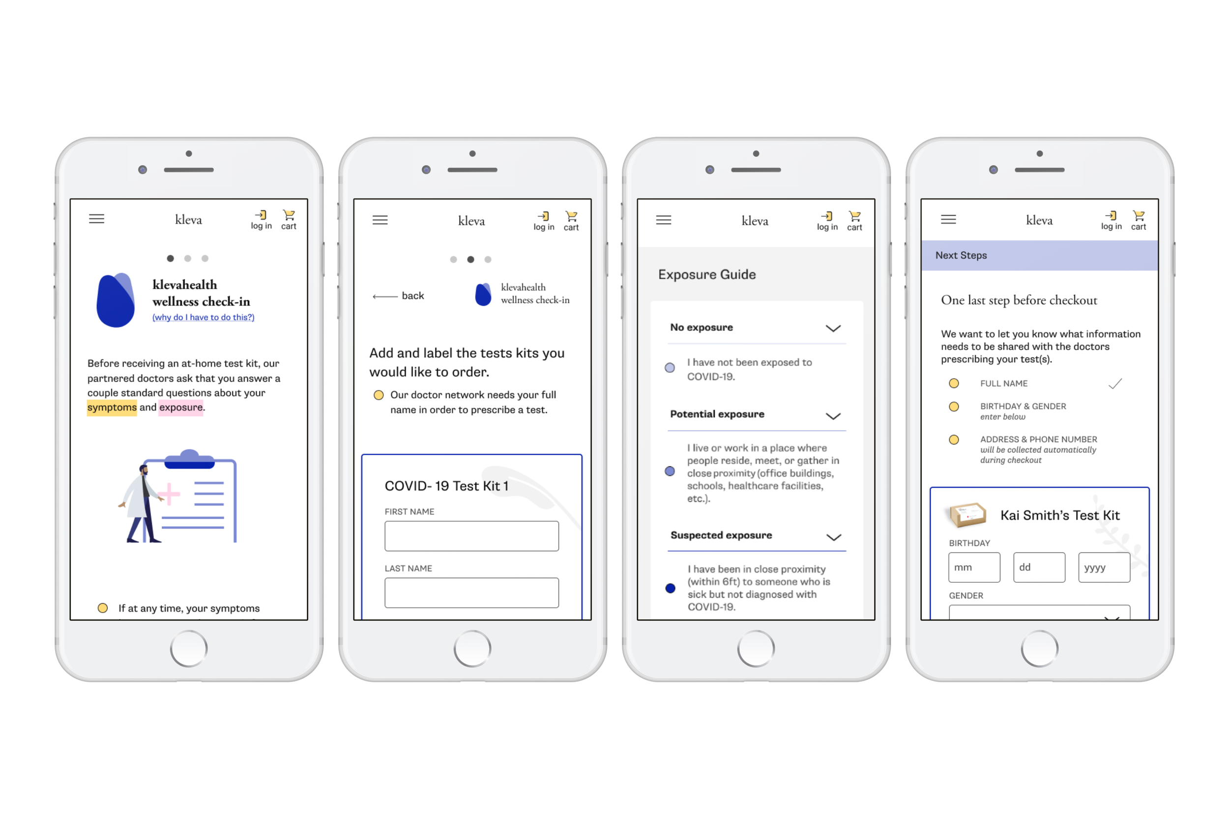
Filling out multiple wellness check-ins in series felt very time consuming to participants. Every test taker needed to answer these questions, so I had to find a way to make the process feel less tedious.
solution
I had to make it clearer that these are simply the questions users would get from a doctor if they were to get tested in person. This would also help trust, because participants mentioned feeling like information from a doctor was the only information they completely trusted. On the first page of the flow, I added copy that indicated the questions were from doctors in our provider network, and at the bottom of each screen in this flow, I added “In Partnership with XYZ Health Network” (real name withheld until launch).
The length of this process was a tougher nut to crack because every person getting a test needed to answer all the questions. I recognized that going through the entire flow for one test and then going back and doing it all over again for a new test could be tedious. Instead, I changed the layout such that the user can answer for all the tests in one pass through. They will still have to answer for each person, but they can take care of everyone at once.
Please excuse V☠️, I was temporarily seduced by the allure of the grid format. It did not last long.
Providing better resources for user questions
The same questions kept coming up during interviews that fell into the following categories:
About Kleva
About the test kit
About COVID-19
I compiled the questions into a separate FAQ page, and put the most pertinent questions related to the test & process at the bottom of the test’s product page.
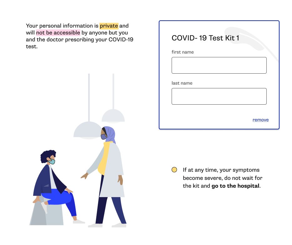
Transparency about personal information
Because the network of providers Kleva works with requires some personal information from users, I created a yellow tool tip to 1. indicate personal information is being collected or 2. provide an explanation for a step that may seem like an unintuitive overstep of privacy for an e-commerce website (like the wellness check in). These tool tips in addition to the FAQ serve to provide more transparency to users about what the Kleva process is.
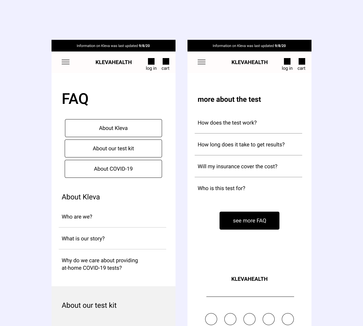
FAQ page and FAQ section at the bottom of the test kit’s product page
Yellow tool tips to alert users about the collection of personal information & explain why
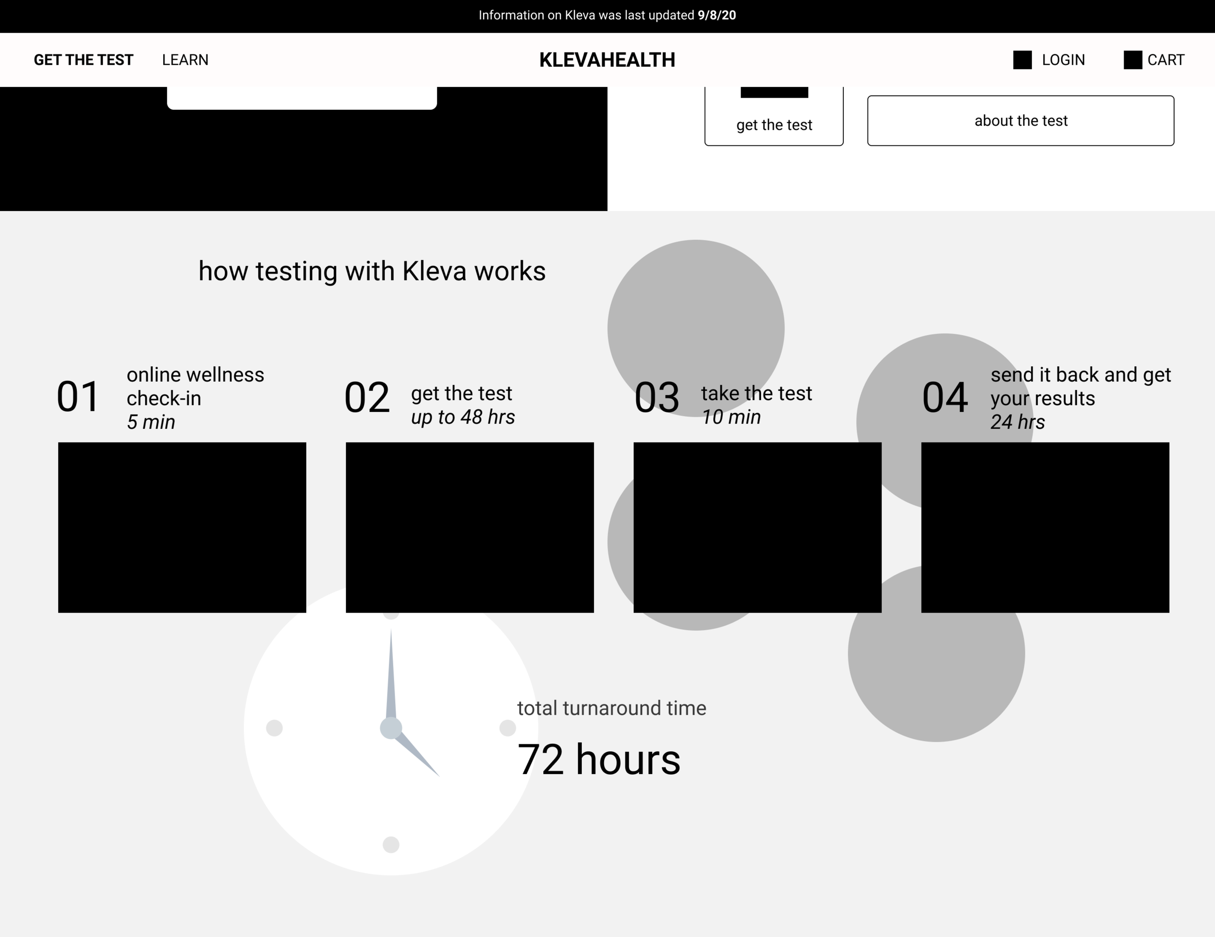
Emphasis on turnaround time
As we learned during interviews, several of our participants had time-sensitive deadlines to get a negative result for COVID. The wireframe used for testing also contained this process outline, but I went back and added the time estimates, total turnaround time, and clock background. I wanted to emphasize Kleva’s awareness that time is an important factor for the potential user, and assure them that the process has a set turnaround time.
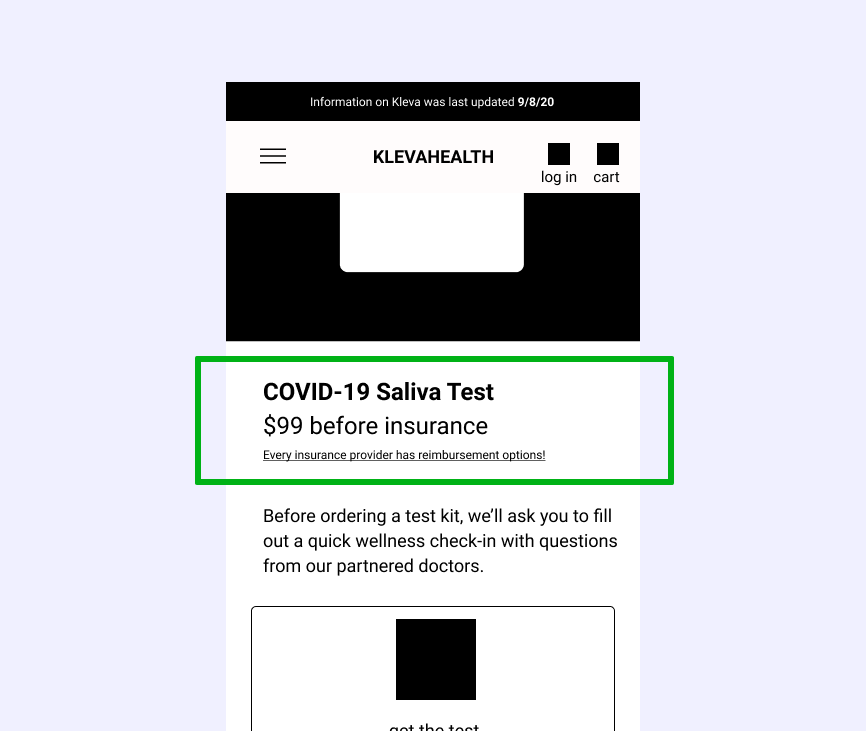
Insurance options
I wanted to make insurance reimbursement as easily accessible as possible. In addition to adding “before insurance” and a link to the FAQ page about insurance, I started exploring ways to give users more guidance. A challenge was that every insurance provider has a different reimbursement process. An idea I started thinking about was emailing users with their documents and links to information so they had everything in one place.
High fidelity
Making a style/brand guide and V1 of the Wellness Check-In flow
The setup
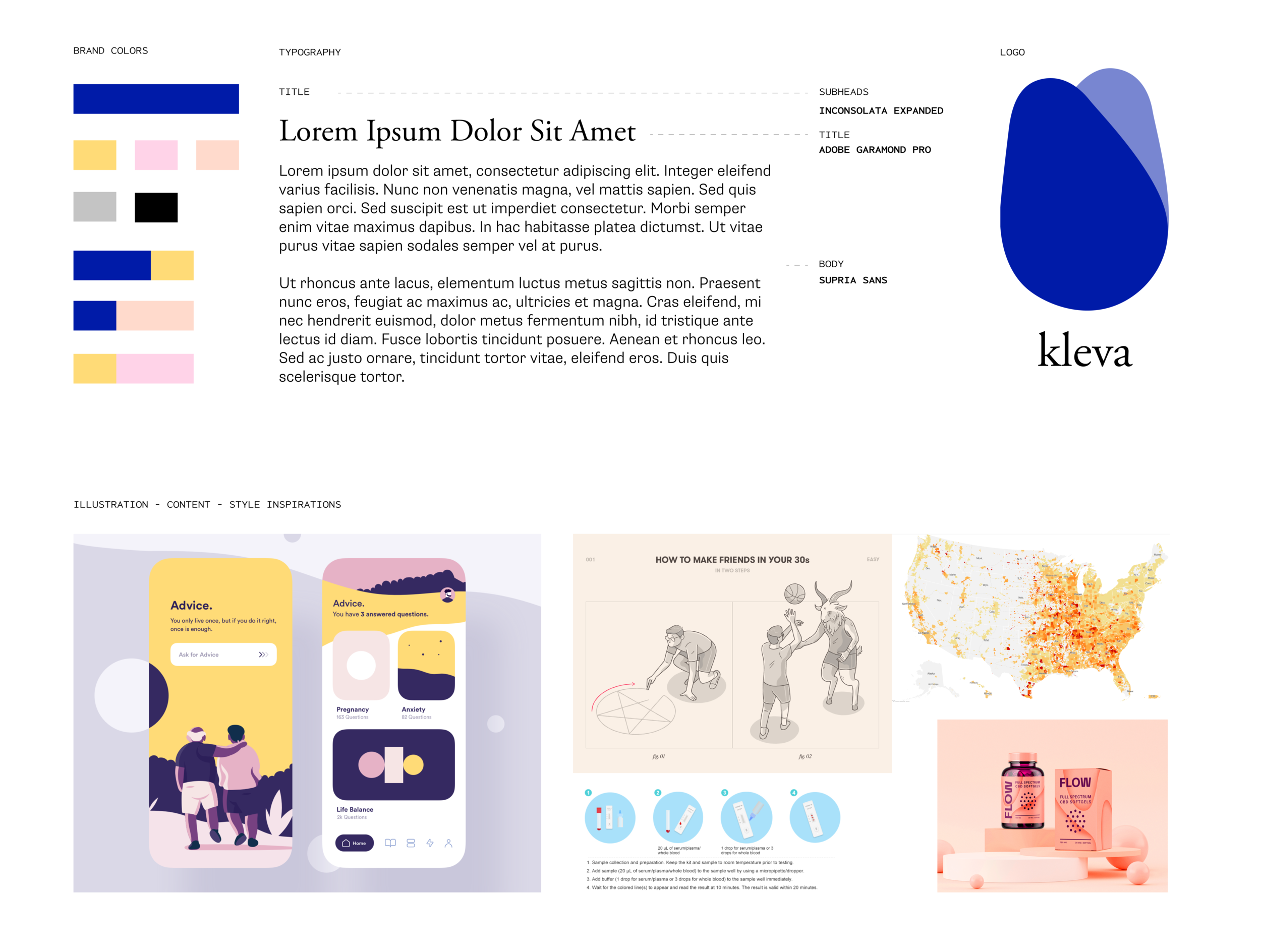
Brand document was put together by Vivek, from a collaborative mood board created by the whole team
To start the high-fidelity process, we first had to decide on color scheme and personality - these were established via mood board and the brand document shown here.
mood
The trustworthiness of medical portals or websites, but with a youthful energy that imbues a sense of hopefulness.
colors
Blue is a traditional choice for medical portals and health tech, emphasizing trust and reliability. To put the Kleva twist on it, we opted for a more vibrant, slightly untraditional blue.
The secondary colors are yellow and pink. Because yellow is the more neutral of the two, it did most of the supporting whereas I used pink as more of an accent color. COVID testing is a serious matter, and I had to make sure the use of these fun colors were coming off as energetic and not adding frivolity to a sober situation.
The screens
accents
To strike the appropriate dynamic/seriousness balance discussed above, I used small, eye-catching accents to add a touch of liveliness.
I’ve assembled some in the accompanying image.
The yellow and pink were used as highlight colors to draw attention to important keywords
Areas where users inputed personal information were kept simple, with a gray shadow of different leaves for differentiation between tests and a little delight
I added little masks to the figures in the illustrations (the figures themselves are from the wonderful Humaaans collection)
The yellow tool tip to draw attention to privacy & important notes (discussed above)
All together, these were some of the screens from the Wellness Check-In flow. Next steps for these bad boys would be another round of usability testing before officially pushing to production.
Conclusion
Takeaways
Finding the balance between dynamic and serious was very important during this process. The colors, design elements, copy, etc. needed to take in users’ worries, and project out reassurance.
The level of guidance a user needs changes depending on the purpose of the website and working on this project with Kleva emphasized the importance of being mindful of this. I went in with a subconscious assumption that the website would mainly be where users would buy the at-home test kits, and conducting user interviews that revealed just how lost people are feeling right now. Our participants described how with every new option for testing they would have to do their own research, so it was vitally important for us at Kleva to anticipate users’ questions and integrate them into the designs.
Next steps
I enjoyed my time working on Kleva’s product, and if I were to continue, here are some of the next steps I would take:
Interview medical professionals who either work at a testing site or have administered COVID-19 tests to get a sense of how we can best match or improve upon the experience users currently have
Create personas (likely agnostic personas) that Kleva can use going forward to solve their users’ main problems while accommodating the diversity of people who need COVID-19 testing.
Define important metrics when the company launches and the website goes live. My recommendation would be to track:
Click-through rate from home screen CTA to the test’s product page to test if the home screen is doing its job in establishing enough initial trust
Drop out & click-through rates during the Wellness Check-In flow — this unconventional step could cause new users to take pause, and tracking these rates will be important in determining whether they are being effectively informed about why it needs to be incorporated into the process
Client testimonial
“It was a pleasure to have Mai on our UIUX team. For Klevahealth, Mai worked on refining wireframes for our e-commerce site. Mai's ability to conduct user interviews and incorporate user feedback enabled her to build and refine wireframes under tight timeline. Moreover, she was passionate about the problem, always came prepared, and was always willing to go the extra mile. There's no doubt that Mai will be an asset to any team.”
— Kai Lim, COO of Kleva
Sources:
Human figures from mockups & project thumbnail are from Humaaans